All posts by Michaël Samyn

The Unreal Forest: step 2

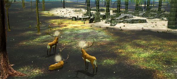
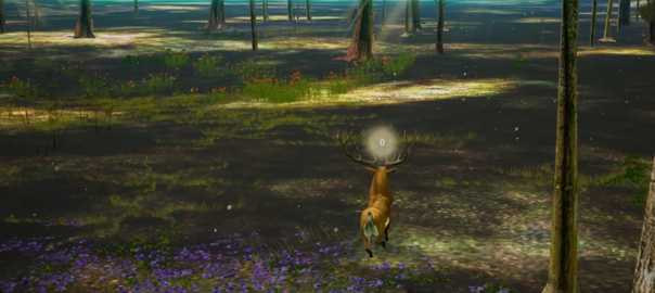
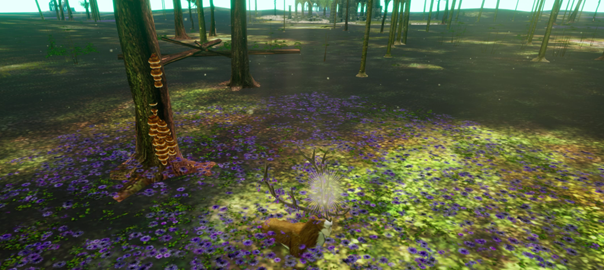
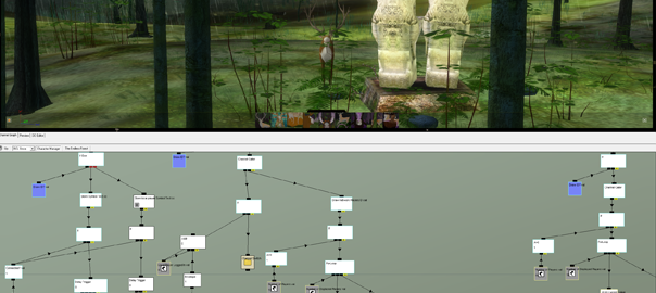
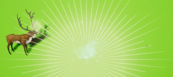
This is a little report to keep you up to date on our progress remaking The Endless Forest in Unreal. In the video you can see how we have set up several crucial pieces of logic that only need to be expanded to approach a full remake.

We have added mouse controls for navigation similar to how it works in the current game. So now we can play with either mouse or keyboard. We have also implemented camera controls that approach the original. Both need fine tuning of course.

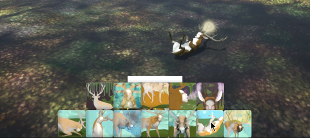
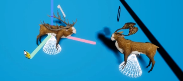
A major part of this step has been the beginning of the button bar at the bottom of the screen that you use for making the deer do things. We had to learn about how User Interface is done in Unreal (somehow game engines always manage to make creation of UI extremely convoluted). So now we can make the deer sleep, get up, sit down and roar with the button bar dynamically responding to the context. For this we figured out how to trigger animations through button clicks and made it work over the network too (which requires quite a few steps). The roar action also involved adding morphing for the deer to open his mouth and 3D sound (the first sound in the remake is roar!). All this new knowledge will come in handy when developing things further!

At one point we managed to run a multiplayer game over both the local network and the internet. But the last time we tried it was broken again. It still works in the editor though so we will focus on other things for now. Hopefully a future update of Unreal Engine will improve how networking is done. If not, we may need some external help.

We’re quite happy with the progress we’ve made. Next month we need to focus on a commissioned project with a rather tight deadline. So the third progress report on The Unreal Forest may take a bit longer. Do keep an eye on Twitter, where we share most of what’s going on here. And don’t hesitate to contact us if you have any questions.

Remaking The Endless Forest was made possible thanks to your generous contributions to the IndieGogo campaign and the private fundraiser. It is still possible to join, and get some of the cool perks like special deer outfits and 3D prints of your very own avatar.

—Michaël & Auriea


Synthetic Image research in March

Our visit to the Kunsthistorisches Museum has filled me with so much inspiration that it proved a little difficult to get real work done this week. But I’m very determined about the next steps.

Collecting notes and photos from the visit took a bit more time than expected. And the 8th anniversary of our game The Path and sharing its new build for Windows 10 also affected the plans. And of course there were the classical guitar studies which I’m taking more seriously than before. I arranged my attendance of the Koblenz Guitar Festival in May. And I visited Ghent’s very own superb luthier Karel Dedain to try out his newest creation.

I did manage to continue the Blender modeling tutorial. Learned about modeling the face this time. Most of the tutorial focuses on modeling the shape which requires a sort of intuitive knowledge of anatomy (that I don’t really possess and honestly am trying to avoid somewhat in order to retain some of the naivety that I admire in early Old Masters). The way that this tutorial doesn’t explain the logic of the structure and instead just shows somebody doing it amazingly well, is not very useful anyway. Most of the instructions are in the form of “adjust the shape”. So I might abandon this thing. Maybe I should do an anime modeling tutorial, instead of a photographically-realistic one. Maybe those shapes are closer to Flemish Primitives.

Putting so much time into acquiring new skills sometimes seems a bit wasteful. I feel I already know a lot. Maybe it would be wiser to apply the knowledge that I have instead of learning new techniques and not actually creating anything. Maybe I should stop doing tutorials and just model what I can.

One of the things that caught my attention in the museum in Vienna was how very refined surfaces are treated in the paintings that I admire. Even with wonky perspective and incorrect anatomy, the artists manage to depict lush materials that give a more sensual sensation of realism, rather than a purely visual one. This made me think I should focus my study more on texturing and shading than modeling.

The museum visit inspired a great idea for interaction with the diorama in Virtual Reality. So I worked a bit more on the simple figure I modeled last month and used it to create a prototype in Unreal. I like the result so far. Some things didn’t work because interaction in VR is very tricky when hoping to avoid nausea.

There is a text that I need to write about an important decision that I have made concerning aesthetic style and conceptual approach of the diorama. I will post that soon.

I’m concerned that all this research and thinking and writing might be getting in the way of actual creation. Sometimes it feels like procrastination: it’s easier to design concepts and develop theories than to actually make something. So next month I will focus more on making! And based on the results we’ll see where I need more theory or research.

— Michaël Samyn.

Angels in Vienna

The Kunsthistorisches Museum in Vienna is one of the nicest museums I have visited. We had been there before but this time the explicit reason was to study the paintings of Archangel Michael by Gerard David, Luca Giordano and Bartolomé Esteban Murillo. I didn’t find the latter but the museum offered plenty compensation. The Kunsthistorisches Museum has a wonderful collection, splendid curation, a great building and cosy couches in ideal positions.

The museum allows one to get very close to the paintings. The alarms don’t go off as quickly as in some other places and many works are not covered by glass. This is enormously risky in terms of potential vandalism or accidents but it’s wonderful for students like me.


The two Michaels

Gerard David: Altar of Saint Michael

When I entered Room 20 I had to steady myself. The small room is filled with Flemish Primitives, many of which I’m familiar with from reproduction. I knew I was going to spend some time here. I don’t even need to look at the works. Merely being in their presence feels like arriving in a spiritual home.

One of the paintings that I wanted to study is in this room too: Gerard David’s Altarpiece of Saint Michael, painted around 1510. The triptych consists of a squarish center panel depicting the archangel defeating demons, flanked by two tall panels each depicting a saint holding a book. On the left, judging by the lion at his feet, is Saint Jerome (amusing combination for me since my brother’s name is Jerome). On the right a man dressed as a monk holding an open book upon which a little naked person is kneeling in prayer. I imagine that little guy to be the Virtual Reality user experiencing the diorama.

Of course the middle panel absorbed my attention. What a glorious composition! The depiction of the archangel controls the picture aesthetically. His figure holds everything in place and he seems completely at ease, leaning on a solid golden section. His spread wings remind of a crucifix. In fact, each of the main figures in the three panels is holding a long staff with a crucifix at the top, together referring to the crucifixion scene on mount Golgotha.

Michael’s face is deeply serene. Its angelic androgyny contributes to that serenity. This is especially striking because of the contrast with the vulgar and grotesque demons beneath him. As is common in the Middle Ages, the devils are portrayed as monsters. There’s seven of them, which might remind of the cardinal sins, according to the museum’s description.

The most remarkable aspect of the action is that Michael doesn’t even harm the demons. He just covers them with his enormous velvety cape: a heavy blanket under which he seems to put the monsters to rest. Almost like putting children to bed, reminding somewhat of virgin and child scenes or even an allegory of charity. He has no weapon. Just a shield and a staff.

The figure of the archangel in this work inspires admiration. He’s not depicted in the usual more symbolic, removed way. Here he feels more like a saint: you want to be like him. Just like Michael, I feel I must confidently and precisely suppress evil. Without emotion. Just do it because it’s right. Like brushing your teeth before bed. Only infinitely harder. Hence the admiration: I wish I could be like him. I know I should try to be more like him. But I also know that I can never achieve this ideal. He remains a inspiring saintly example.

In the background we see three angels seemingly sweeping up hords of demons. Almost like a mundane housekeeping task. Just doing the work.

Of note is that the demons are not cast into some vulcanic pit of hell. But apparently down to earth. Is earth hell?


More thoughts in Room 20

I found another depiction of the Archangel Michael in the same room in the tiny Maria with child by Van der Weyden’s studio: a decorative architectural ornament depicting Michael with raised sword chasing Adam out of Paradise.

On the other side of the room, two larger panels by Hans Memling depicting Adam and Eve. I was especially struck by their faces. They look so fresh. Surprised. Filled with wonder. Have they just been crying? Have they just been born? Innocent beauty (right before biting in the apple they are holding). Very naked.

And there’s much more in the small room! A triptych by Memling of the Madonna flanked by the two Johns, an intense crucifixion by Van der Weyden featuring Magdalena and Veronica, remarkable dark blue angels and a fantastically imaginary Jerusalem in the background, a small diptych by Hugo Van der Goes with a fall of man and a deposition, some wonderful portraits by Juan de Flandes, and several more small pictures.

Suffice it to say that I didn’t make it. I didn’t succeed in observing every painting in Room 20. It’s all so intense. Luckily Room 13 next door has comfy couches and walls plastered with Rubens. The irony of such spectacular work having a relaxing effect!


Luca Giordano: Saint Michael vanquishing the devils

Of an entirely different order is Luca Giordano‘s gigantic painting of Saint Michael vanquishing the devils, hung impressively central in a huge room. Painted around 1666 in Italy this is a highly baroque picture with diagonals and spirals swirling over an otherwise fairly static symmetrical composition. Typically for the more modern approach to painting, the work is very narrative, with realistic depictions of humans representing allegorical themes. And it’s intentionally spectacular.

The painting is so large that standing close to it means that I join the devils at the bottom with Michael towering over me as well as them. This painting represents an entirely different approach to religion. For David, the archangel is an inspiring caretaker, for Giordano he is a powerful warlord.

Even more than Raphael’s Michael that I explored in the Louvre last month, Giordano’s seems to dance on top of the demons. Despite of the raised sword, he doesn’t appear emotionally involved in a battle. He’s doing a dance. Going through the motions. Certain he will win. That is the will of God, after all. He is just performing the eternal ritual. The effortlessness of tiptoed balancing on the devil seems to mock all illusions that evil ever had any chance of winning.

It’s not an intimate scene. The light triumphs over the darkness. Simple, clear. Cherubs in the sky. Devils on the ground. The red glow below seems to suggest an underworld, not the surface of earth. Behind the angel the clouds break open to let the divine light stream in. Everything is yellow, brown and red. Michael stands out with blue and green garments inspired by Roman armor.

Typically for the modern era, the devils are depicted as almost humans. Only their little horns, small bat wings, pointy ears and long nails signify them as evil. Giordano also has Satan mimic Michael’s pose with raised arms and spread legs and wings, reinforcing the notion that the two are brothers. Typically Lucifer is naked and Michael dressed.

Unsurprisingly with sensual work like this it’s easy to read a erotic undertone in the scene. Michael is offering Lucifer a look under his skirt but Lucifer turns his head away. This causes Michael to blush. Michael is wielding a red hot sword (a flaming phallus). He’s also very feminine: skirt, cape draped like a shawl, long curly hair, graceful pose, feather on his hat.

Curiously Lucifer seems to have been sitting on a chair -a throne?- when Michael attacked him. Maybe the other devils were carrying it.

The work struck me as a depiction of a three dimensional scene that the artist imagined. Even if that scene is hard to read here and there, it is the unseen three dimensional reality that matters. Very much like realtime 3D.


More museum musing

Perugino and Raphael

Seeing the multiple Perugino paintings in the museum’s collection I suddenly understood the desire for pre-raphaelism. Raphael’s work is undeniably beautiful, clever and sensitive. But his teacher’s work still holds the mystery of the primitives. There is magic in Perugino’s worlds. Mystery. Awe.

That makes them harder to appreciate. Raphael is easier on the eyes and mind. But Perugino shows us the true holy essence of existence. And sometimes we just don’t want to know how devastatingly dazzling our existence is. Raphael distracts us from being too acutely aware of this. He consoles with the charm of mundane prettiness.
Perugino is stubborn. He’s not fishing for compliments. Not trying to make your life easier. He’s a hardcore painter of an irrefutable truth that is agonizingly mysterious.

If you mock a Perugino or have fun in its vicinity you will most certainly be struck by lightning. That’s what the eyes of his figures seem to say. They force you into sincerity. And it’s a pleasant sensation. To be allowed to be sincere.

If the Raphael is the exquisitely well made entertaining blockbuster then the Perugino is the annoyingly obscure clumsily shot art house film. Ridley Scott versus Chantal Akerman. Guillermo del Toro versus Andrei Tarkovsky.


Rewarding attention

One of the things that I admire in the Flemish Primitives is their devotion to detail. Unlike later painters, they eschew suggestion. Everything in their paintings is actually there. When you observe closer, you see better. As opposed to baroque painting for instance where zooming in only reveals a paint stroke (admirable effect in and of itself, of course).

This necessity for things to actually exist feels similar to the requirements of computer-based realtime 3D. I have long been annoyed by the difficulty of simply suggesting shapes in my medium. But the Old Masters are helping me to embrace this aspect and teach me how to use it.

Extreme detail in art gives a feeling of preciousness. It demands reverence, respect. And, importantly, it rewards the viewer for paying attention! The more you look, the more you see. The closer you look, the better you see.

This is not exclusive to the Northern Renaissance. The Italian mannerist Bronzino also rewards attention. Getting closer does not disappoint. Like in the work of the Flemish Primitives, the closer you look the more you see. It’s always sharp. The picture never dissolves into brush strokes. At least to the naked eye! Of course brush strokes are revealed when we blow up technical reproductions. Demonstrating how the art is made to the scale of the human body. Just like Virtual Reality.

You must paint individual hairs!


More Michaels

That evening we attended a violin quartet performance in the baroque Saint Anna church. They played an early piece by Vienna’s superstar Mozart and a wonderful rendition of Schubert’s Death and the Maiden.

Right above our heads, like a sign from heaven, a glorious Archangel Michael chases a bunch of devils out of heaven with firy lightning bolts in each hand. Again dancing on tiptoe.

The next day we went back to the museum. I still felt somewhat drained from the intense experiences in Room 20. So I strolled around the museum more leisurely, and visited the musical instrument collection, the Greek and Roman collection and the decorative arts section, before diving into the picture gallery.

There’s a room filled with paintings by Bartholomeus Spranger, a unique Flemish mannerist painter. His work is extremely erotic. It is simply custom in his world for women to bare their breasts. Even when they are otherwise fully dressed. So too his Minerva victorious over Ignorance which feels a bit like a Michael vanquishing Satan. Except, of course, typically for the time, it is wisdom that triumphs, not faith.

I found another Michaelesque scene in Zucchi’s Immaculata. In it the virgin moon goddess stands on the head of a devil.

There’s a wonderfully refined sculpture by Johann Schnegg in the Kunstkammer. The figure of Michael is carved in ivory while Satan is made from ebony. Satan gets to have feathered wings rather than the usual bat wings. As opposed to their static appearance in many depictions, here Michael’s wings seem very much a part of his body as he raises one together with his right arm. And even in these delicate materials, Michael balances on one foot on a devil lying on a cloud covered globe.

Save

Save

Save

Save

Save

Save

Save

Save

Save

Save

Save

A journey through sound in Karlsruhe

Last Tuesday I visited the Siccas guitar store in Karlsruhe, Germany. And it was well worth the six hour drive from my home in Ghent, Belgium. Manuel Luchena proved a wonderful host offering me many different guitars to try and sharing lots of insights, despite my relatively low level of expertise as a classical guitar student. I made an enchanting journey through the diverse universe of sounds that different types of guitars can produce.

We started with the Hanika Natural Torres but it only took a few seconds to realize that this guitar felt too much like a factory-made instrument for my taste. I am interested in a Torres style guitar but the Hanika has nothing to do with Torres really except for its fan bracing.

I don’t know what it is exactly but an instrument made by hand by a single dedicated person just feels better. You can tell the difference by simply touching the guitar, even before hearing it. And the sound almost always proves you right. When it comes to factory-made guitars, in my albeit limited experience the cheaper models are more interesting than the high end ones. They tend to have more character.

A more interesting encounter followed with several Milestones models, designed in Germany but built in China, presumably at a fraction of the price. The Milestones Torres Relic is a surprisingly nice instrument with a sort of worn look. But I think I would outgrow it quickly as a student. I need an instrument that is both comfortable to play and challenges me to learn. And while I am looking for a shorter scale guitar to fit my small inflexible aging hands, its 630 mm is just too short. Milestones creates guitars inspired by classic designs. They’re German style guitar is great too but not exactly what I need now. I also tried the Milestones Romantica Relic. Better than the cheap romantic guitar I have at home, and with a wider neck and proper tuners, it still felt similarly limited.


Manuel offered me an 1840 René Lacôte romantic guitar in comparison. What a difference! Despite its smaller scale and oddities like a fretboard level with the body, this instrument does offer a variety of sounds similar to that of classical guitars.

At the complete opposite end of the spectrum, but also made in China was Yulong Guo’s Chamber Concert model. This guitar combines all the modern features in one instrument: a double top, lattice bracing, an arched back, an arm rest and an elevated fretboard. My god! The dark booming full sound that this instrument produces hardly reminds of a guitar anymore. It’s very dark and loud and a lot of fun to play but not suitable for my taste and need now. It would be wonderful to have around as a second guitar, though, to play for fun.

The only other lattice braced guitar I tried had been built by my fellow citizen Karel Dedain. I had recently played a new classical model in his Ghent studio and was curious about this one. If only because I love the idea of having a guitar from a luthier in my town. What a difference with, frankly, most of the lattice braced guitars that I’ve heard! Unlike those, this instrument is subtle and refined, it sounds and feels much more like a “real” guitar (not like a piano, e.g.), despite of the typical evenness of tone.

Back in the world of Torres, I enjoyed Marco Bortolozzo‘s copy of one of the master’s designs a lot. Assuming the odd buzzing on the second string would disappear after a while (as it does on third on virtually all guitars), this is a beautiful instrument, in part due to the pale birdseye maple sides and back which both sound and look good. Its slightly smaller body also feels very comfortable to me.

Another luthier I had been curious about ever since I started this exploration is Roy Fankhänel. And luckily Siccas had a recent model in stock! I had grown a bit sceptical about what I considered its too modern sound for my taste (as witnessed in online videos). But those reservations faded away after only the first seconds of touching the instrument. It sounds great and is very easy to play. But I feel too inexperienced for it. Which is just as well because it is quite a bit above my current budget.

So Manuel offered me a guitar that costs more than twice that much! Oh man! I can see why Hauser guitars are revered the way they are. The Hauser III is almost intimidating. Such a mature instrument! It feels like some sort of father figure. I am definitely not ready for it! I can’t even begin to describe the unique sounds that come out. And I know I don’t have what it takes to make this instrument sing. I did note how the typically flat bottom of the Hauser design fits very snugly against my right thigh. Nice!

Also from Germany but very different, was the guitar built by Cornelia Traudt. A very unique instrument with oddly thin basses and clear trebles. It felt as if the volume increases as you go down the strings. Peculiar. Interesting.

As we were deviating from the purchase path into an exploration of sound, Manuel handed me a John Ray encouraging me to appreciate what he called the dry sound of guitars made in Granada. As he noticed I wasn’t completely convinced, he gave me a Eduardo Durán Ferrer guitar, also built in Granada. Wow! Playing it feels like warm weather! Sitting in the sun. I can see what he means by dry now. Somewhat shorter sustain than what I’m used to but beautiful in its own way. This guitar also had a very thin D-shaped neck profile which worked really well with my (bad) habbit of resting on the tip of my left thumb.

To make the comparison with Madrid he first let me taste a Granada-built cedar top guitar (so far we had only tried spruce tops, because that’s what I’m interested in at the moment). Still “dry” despite of a slightly longer sustain. But the difference with the cedar-topped Bernabé Concierto is remarkable indeed! The guitar from Madrid sounds much more like the classical guitar that I’m familiar with: rich, round, versatile. But that doesn’t make it better. And that was the most interesting outcome of this journey for me: that there’s many different types of guitars and that many sound interesting for one or another reason, without one being particularly better than the other (with the possible exception of the Fankhänel and the Hauser that I don’t feel experienced enough to judge yet).

To experience all these sounds first hand, has been a true joy. And I feel so much better informed now. I’m also secretly proud that my fellow citizen’s work holds its own even among that of so many other great artisans.

―Michaël Samyn.

Save

Save

Synthetic Image research in February

The central event of this week’s work on The Synthetic Image was a visit to the Louvre museum in Paris. Intended to study the two paintings of Archangel Michael by Raphael, the hours spent roaming the endless museum halls also inspired a great many ideas. More about that here.

To prepare for the visit I read up a bit about Raphael’s life and work. I discovered how 16th century art historian Giorgio Vasari deeply idolized the painter for his politeness and friendliness. In stark contrast to contemporary colleague Michelangelo, apparently: “Nature created Michelangelo Buonarroti to excel and conquer in art, but Raphael to excel in art and in manners also.”

This renewed encounter with the high renaissance did however make clear that, despite of my deep enjoyment of this and later art, what I am hoping to approach in The Synthetic Image is only really present in earlier art. Sadly the museum rooms dedicated to the Northern Renaissance were closed for restoration. And the Louvre only has a few pieces by Southerners (Crivelli and Botticelli) that help my research.

In terms of actual work, I continued my tutorial in Blender with the basic modeling of a face. And while I do learn about some handy modeling features, the tracing of photographs in this tutorial seems to counter the anti-photography stance of my project. I do learn techniques but the tutorial doesn’t help with more technical aspects of either mesh construction or human anatomy.

The day after the visit to the Louvre, I was still exhausted from the trip. So i didn’t get much done. Something to keep in mind for future journeys!

On Friday I had planned to work some more on the diorama prototype. But since I didn’t want to work with Unreal’s standard mannequin character, I looked into an add-on for Blender called Manuel Bastioni Lab. This application can generate human bodies based on given parameters, including a poseable rig. It’s very impressive software but the choice between heroic, realistic and anime styles doesn’t make it suitable for my needs. The models are also far too detailed for my current prototyping needs.

I decided I should model some figures myself. Confronted with the empty startup scene in Blender, however, I felt at a bit of a loss on how to start. So I did a tutorial for modeling a very basic human figure. I ended up having quite a bit of fun modeling the shape better than in the tutorial. But I also realized that I lack some basic knowledge about the form of the human body. So I decided I need to study that a bit. I don’t want to learn actual human anatomy for fear that I would lose the naivety that I share with the early renaissance painters. So I started collecting screenshots of low poly meshes to sketch from.

Moodboard for the design of the Diorama of Archangel Michael

And finally I worked on the design of the diorama and created a moodboard with decisions about scene, colors, clothing, etc. I realized that I can’t help being modern. No matter how much I admire the Old Masters, I keep having ideas that one would never find in their work, but that might appear in more recent art. Such as my desire to depict Lucifer as almost human, much like Michael. This is something that artists had only been doing since the baroque. In earlier art, Lucifer is always depicted as a grotesque monster. Indeed one can see this evolution in Raphael’s own work: his early Lucifer resembles a dragon, the later one a satyr.

Sadly I didn’t get around to prototyping the design. Looking forward to doing that next month!

— Michaël Samyn.

Save

Save

Save

Save

Save

Save

Save

Save

Raphael’s archangels and Louvre inspirations

The two paintings of the Archangel Michael by Raphael were the direct reason for wanting to visit the Louvre again. Paris being only two hours away from our home, I travel there regularly. But Raphael hadn’t moved me much in the past. And seeing the two paintings in person didn’t blow me away this time either.

The paintings of Archangel Michael by Raphael in the Louvre. The small work on the left was painted when the artist was 21 years old. The large painting on the right was created at age 35, 2 years before the artist’s death.

The first painting is very small and created when Raphael was in his early twenties. It’s interesting mostly because the figures of Michael and the monster are set in a desolate landscape that seems to refer to the book of Revelation (in which the Archangel makes a prominent appearance). It’s a mysterious scene depicting monsters, souls of the damned and a city on fire. Young Raphael is trying to tell a big story in a small picture.

The second painting is very large, and painted two years before Raphael’s early demise. A much more mature work, the painting depicts Lucifer and Michael in an otherwise empty landscape, dark and rocky at the bottom, where the demon is being trampled, with some signs of volcanic activity, bright and peaceful behind the triumphing angel. The diagonal composition and decorative flying fabric already announce the baroque style in an otherwise high renaissance image.

In both pictures Michael is wearing golden armor, covered in some areas by blue fabric (a skirt in the first and a cape in the second). This inspired the thought that perhaps my Michael could be covered completely by body hugging golden armor that would only leave the face free, prompting the spectator to wonder whether he is made of gold. He is an angel after all, not a human. I may also copy the idea of the light flowing fabric on top of the armor.

Or perhaps the color of his skin is simply gold. It does appear so in the second painting. Only the decorations in the metal show the difference between skin and armor. Maybe in the diorama he could be fairly naked.

In both images, Michael’s wings appear heavy, immobile almost, as if they too were made of gold. That’s an interesting idea, making the figure seem more like a statue than a person (which would fit the diorama concept). But I also like the opposite: bright white feathers, divine, not his own, directed by God, as if Michael is a puppet on strings. Feathers. Fingers. Feathers everywhere. Maybe Michael has many hands?

The scale-like pattern on Michael’s armor looks similar to Lucifer’s skin.
The blue fabric against blue sky makes him look ethereal.
The spear point is cross shaped. If it were to pierce the devil, it would leave the imprint of the cross of Christ in the victim’s flesh.

It came to me that in none of the images of Michael and Lucifer that I can recall, the devil is ever killed. Michael always only subdues him. In both Raphaels he balances on one leg, holding down the demon’s body. He dances on the evil. Perhaps this is significant. Perhaps he does not kill because the battle against evil is an ongoing, never-ending process.

Maybe Lucifer and Michael are each other’s mirror. Both angels, demonstrating the opposite paths that can be taken.

I discovered a few more depictions of the Archangel on my stroll through the museum. The Ercole Roberti had a similar thing going on with hard armor covered by flimsy fabric, transparent even in this case. Lucifer appears completely naked. It made me think that perhaps in my version he could just be a naked human, not a devil, just a man with dark, grey or greenish skin.

The piece by the anonymous medieval artist referred to as the Maitre des Anges Rebelles is very spectacular. Floating in a sky seemingly ablaze with gold several golden angels battle dark demons falling to a small dark planet beneath. In the top triangular part God on a throne surrounded by angels and saints much as described in the book of Revelation.

When I wandered off into the Object d’art section, references to the archangel didn’t stop. I saw a curious bronze lamp by Félicie de Fauveau from 1830 depicting Michael accompanied by four winged knights in heavy armor resting or asleep. There was also a bronze clock from the same period with hands in the shape of snakes featuring a scene with a very feminine archangel towering upright over a fallen demon who seemed twice their size, snakes everywhere. And finally a very delicately sculpted ivory spectacle with an elegant archangel standing or floating atop two demons, one upside down, whose positions seem to be mockingly imitated by cherubs alongside Michael. Again, Michael dressed and the demons naked.

What makes the synthetic image so powerful?

The Louvre is an interesting place for my research because the collection contains both the older paintings that inspire the Synthetic Image project and the younger ones that don’t have the right effect. The difference is very clear. But hard to put into words. Let alone apply to my medium. Sadly at the moment the museum rooms where the strongest representatives of the power of the Synthetic Image, the Northern Renaissance, are hung were closed for renovations. I may need to resort to juxtaposing similar reproductions to figure it out, for now.

There were many artists copying from the masterpieces on the wall. But invariably their copies seemed to be lacking the essence of the original. It feels as if modern copyists don’t see the picture in front of them. It’s like they are trying to paint a photographic reproduction. Preferably with some improvements in terms of realism. Maybe they don’t understand that what is bad about the original in terms of realism is what makes it so good as art.

It made me think that the mantra they hammered on in art school is wrong. Maybe we should not “paint what we see”. If we do, we seem to miss the point. We stay on the surface, quite literally, and our paintings are mediocre. Maybe we should “paint what we know” instead, what we know to be true, how we feel inside that things exist. It doesn’t need to look real. It should feel real!

As my stroll slowly approached the modern age, paintings started to become more narrative. They were clearly trying to tell stories. Not the myths and legends that everyone knows but very specific tales. It was quite impossible to decipher many among them. And yet the artists seemed to try their best to express this or the other story. A waste, if you ask me. I think referring to stories is fine. Just assume people know them. Even if they don’t, they will feel the mystery. Or just add text somewhere, telling the story. Another mantra, “Show, don’t tell”, doesn’t seem to apply to The Synthetic Image. Just tell, and make a great picture. Don’t conflate the two. Don’t try to express the story in an image.

Another thing I noticed is that figures in more modern paintings (starting already in the 17th century) are striking because they feel like real people. You can sense their personality. Their strength or weakness. The painting records and expresses this. Without trying to rise above it. And while that often brings a pleasant experience to the spectator, it’s not what I am after in the Synthetic Image. I need more distance, more archetypes perhaps, figures unlike you and me, but that do, perhaps, sometimes experience emotions that we do too. Only they know how to deal with them much better than we do. They are exemplary. Unlike we.

―Michaël.

Save

Save

Save

Save

The Endless Forest multiplayer in Unreal

The Unreal Forest: step 1

We have made quite a bit of progress in the past few weeks with the remake of The Endless Forest in the Unreal Engine. Thanks to the generous support of many of you, we can make this work our highest priority. We are continuing to raise funds to support this project. You have almost collected the entire amount!

Since The Endless Forest was an early project in our career as game developers, and because it has been developed over several iterations, we haven’t been very orderly in storing the many assets that make up the game. So we’re going through our archives and fishing out every model and texture, sometimes even finding things that never made it into the game (but that might now!).

Because of the engine we used back then, Quest3D, many of the files are in obsolete formats. So part of the work involves converting everything to a format that we can use in Unreal.

Unreal Engine uses a very different paradigm to game creation. It lacks certain features we took advantage of in Quest3D. But it also does a lot of things much better. As a result, however, we cannot simply translate the logic from one program to the other. We have to find new ways of expressing the same ideas, ways that suit the engine well.

I’m delighted to say that we have solved two of the more problematic bits of logic now. Both are related to the endlessness of forest.

First we needed to find a way for the forest to wrap around endlessly so that when the deer arrives at the end of the forest, it finds the beginning again. After some initial despair about not being able to figure out how to implement the same logic as in the old game, we got a brand new very simple idea that actually works fine.

But wrapping one avatar around from end to start isn’t enough. We also need to be able to see other players’ avatars even when they are at the beginning of the forest while we are at the end. We found a solution for this too. And one that has the additional benefit of only rendering the deer that are actually visible, which is good for performance. The system involved separating the “pawns”, as Unreal calls the player avatars, from the actually rendered deer. That caused quite a few headaches dealing with the rather arcane server-client structure of Unreal networking, which seems to be entirely built around preventing cheating, something we don’t care much about in the Endless Forest (in fact, we consider many ways of “cheating” as part of the fun).

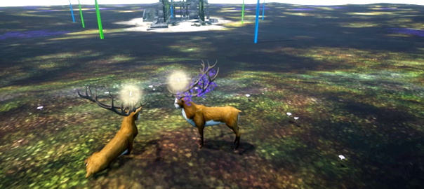
Anyway, as you can see below, we can now run a simply networked game with deer who see each other in Unreal now.

The Endless Forest multiplayer in Unreal

We were very eager to share this mini-triumph with you and tried hard to set up a server that you could log into. But this is an area where Unreal is a lot less streamlined than in most others. Creating a dedicated server actually requires downloading and compiling the source code of the engine, and packaging the game through an external tool. In the end we succeeded in running the game on our local network. But only for a minute or so, before clients were mysteriously disconnected.

We haven’t been able to try this on the internet because our current game server is an old 32 bit Windows XP computer and this is not really supported by Unreal. So we’re asking our host to move to a new server machine.

We are eager to continue the work on this project. It’s very exciting to see the deer run around in their new home. We will keep you posted on our progress.


Thank you for your support!


—Michaël & Auriea


We are eager to coniSave

Save

Save

Save

Save

Save

Save

Save

Save

Save

Save

Save

Save

Synthetic Image research in January

The first week I had reserved for The Synthetic Image research project sadly suffered from several unwelcome distractions and interruptions. Excessive rainfall had caused clogged drains in our new home that took two days to investigate and repair. Our car had a flat tire that needed to be fixed. I had to do some accounting work and there were the usual groceries and guitar lessons.

I did manage to look up the locations of paintings I want to study. I wrote an introductory text to the project, described my diorama creation plans and analyzed Crivelli’s painting of Saint Michael that I hope to see one day in person in London.

I started the tutorial series by Angela Guenette for Character Modeling in Blender. This taught me some handy modelling features that I wasn’t aware of. And I learned how to model an eye with a recessed iris and an extra layer for the cornea. The realist purpose of this method did make me wonder if it would be at all useful towards achieving the “Primitive” style I am after. But I need to learn basic skills.

On Friday I set up a rudimentary diorama prototype in the Unreal engine with the default mannequin and cursor key input. While simplistic, it does give me a lot to think about. I also briefly investigated Virtual Reality camera handling in Unreal.

An eye in Blender and a mannequin in Unreal.

Unfortunately I suffered from an inclination to procrastinate on Friday. Which is silly because as soon as I do actually start working, I enjoy it a lot. But then there’s too little time left. I’ll do better next month!

Tomorrow, Sunday, I plan to visit the Museum of Fine Arts in Ghent to hopefully take a closer look at some of the Mystic Lamb panels while the restoration crew is not at work. And maybe there will be other pieces that attract my attention.

— Michaël Samyn.

Save

Save

Save

Save

Save

Save

Save

Save

Carlo Crivelli’s Saint Michael

Carlo Crivelli: Saint Michael

Carlo Crivelli: Saint Michael (about 1476)
90.5 x 26.5 cm
tempera on poplar
currently in the National Gallery in London

This analysis was done on 18 January 2017 based on photographic reproductions found on the internet.

One of 4 panels from an altarpiece in Ascoli Piceno, a town in the Marche region in East Italy where Crivelli died in 1495. The other panels depict Saint Jerome (in red, holding a book and a building and with a lion at his feet), Saint Lucy (holding a palm branch and a round plate with eyes) and Saint Peter Martyr (in monk’s habit with a sword in his head and a dagger in his chest). I didn’t find an image of the entire altarpiece.

Michael is looking down at the demon under his feet. He is holding his sword behind his back. Not so much as if he is about the strike, but in rest, as if he knows he has won and is in control of the situation. This relaxed attitude is confirmed by the delicate pose of his left hand as it holds a scale between thumb and index finger. In the scale a tiny naked kneeling man and woman appear lighter than the silver tent-shaped weight in the other scale. Maybe the tent represents the heavenly Jerusalem (the tabernacle of the lord). Crivelli has omitted one of the ropes that would be holding up the scales presumably not to intersect with the figures. The scales are tilted towards the spectator in a way that defies either gravity or perspective.

Michael’s chest is covered by ornate golden armor centrally featuring a baby’s head, possibly a cherub, and flowers on his nipples in an ornament that vaguely suggests breasts. His skirt consists of several layers, three of which appear to be made of feathers. Maybe they refer to his wings that are only partially visible, folded behind his back. They seem to have the same colors: red, green and white. His thighs are covered by armor in the shape of lion heads. His calves seem to protrude out of the lions’ mouths. Right under his knees appears a golden fish-scale pattern, perhaps indicating chain mail. Suprisingly, and confirming his relaxed attitude perhaps, his lower calves, ankles and feet are bound in cloth, leaving an opening for bare toes. The bandages have the same striking pale blue color as the armor on his thighs, underneath the lion heads. He wears a short gold-rimmed cape that is green (velvet?) on the inside and red or pink (satin?) on the outside. Crowning his half long golden hair in page style is a pearl band with a gem in the center and a green feather that looks like a palm leaf. Behind his head a golden aureola with ornamented edge.

The background is a golden floral geometric pattern (like wallpaper) bordered at the bottom by an ornate terracotta frieze. The floor is made of yellow marble and is less than a meter wide. The scene takes place on some kind of ledge. Two shapes in the ornamented border of the ledge seem to mimic the demon’s head.

The demon beneath Michael’s feet is green. He lies on his back. He is naked. His feet are brown and remind of bird of prey claws. He has a tale like a lizzard’s that ends in his crotch with something like a sex organ. His body is shaped like a male human’s but his skin consists of scales, like a reptile’s. On the back of the calves we see some curly hairs. His left hand clasps Michael’s calf while the right reaches up. His fingers end in black claws. He has short bat-like wings, green like the rest of him. The demon’s head is covered by short brown thick curly hair and hangs over the ledge. He has two curved horns that look like those of some kind of gazelle or even an insect. His ears are long and pointy and remind a little of a donkey’s (also because of the white hair inside). Two white fangs and a red tongue protrude from his red lips. He might be smiling. Like Michael’s, Satan’s eyes are not visible. He seems to be looking into Michael’s eyes.

Because the two figures are engaged in an almost intimate staring context, the scene feels closed. Or maybe Michael is simply making sure that the demon cannot escape, for our benefit.

Since the humans in the scale are too light, presumably they are damned. Maybe that is who Satan reaches out for. Perhaps Michael’s calm signifies resignation. Maybe the scene is not static at all and we see Michael putting away his sword, preparing to release the light-weight humans to the devil. The baby on his chest armor seems shocked or even sad. The demon seems to be gurgling “These two are mine, Michael! Give them to me!” And Michael looks at him and then at the scales and he knows that Satan is right. There’s nothing he can do for the little people.

That the humans are man and woman could refer to Adam and Eve, the first humans that Michael delivered to evil, to the extent that he chased them out of the Garden of Eden.

Michael’s face appears calm. He knows how these things work. “I am stronger than you, Satan. But rules are rules. These two are yours. They are too light for Heaven.”

The entire composition fits tightly within the vertical panel.
There are some very light drop shadows behind Satan, to the right, consistent with the light in the entire scene, coming from the top left. Here and there dark lines appears between two shapes, giving the drawn effect that is typical for Crivelli’s work, but these might be interpreted as shadows too. Some are blurrier than others, suggesting depth.

Part of this painting is made in relief. In a reproduction it’s hard to see what exactly. The ornaments on the armor definitely, perhaps also on the arm, and the locks on the legs. Maybe the head band too (silver!). And the gem? The aureola’s border seems relief as well. Elements of the scale maybe too.


— Michaël Samyn.


Save

Save

Save

Save

Diorama of Archangel Michael

Statue of Saint Michael by Remi Rooms
Statue of Saint Michael by Remi Rooms on Saint Michael’s bridge next to Saint Michael’s church in my home town of Ghent

The choice of Archangel Michael as subject of my diorama is obvious: he is my patron saint since I carry the same name (although my atheist parents named my after the Florentine renaissance master Michelangelo Buonarroti). As a result I have always been fascinated by depictions of the archangel.

Historical depictions

Archangel Michael is most often depicted as defeating Satan, another angel who rose up against God. I don’t believe this story is mentioned in the Bible but it is an important part of the premise of John Milton’s Paradise Lost, which I have recently read in a splendid Dutch translation by Peter Verstegen. According to Milton the expulsion of Satan from heaven lead directly to the seduction of Eve and the subsequent fall of man. One can sometimes see the Archangel Michael guiding or chasing Adam and Eve out of the Garden of Eden (also mentioned in Paradise Lost).

The second most occurring depiction of Saint Michael is in scenes depicting The Last Judgement. In the biblical book of Revelation he, once more, defeats evil. But in paintings he is more often shown holden a scale and weighing people to separate the ones who will be saved from those who are damned. Sometimes he battles Satan over a particular soul. So Michael plays a prominent role both at the beginning and at the end of the world.

Personal meanning

There’s a certain symmetry is the expulsion from Paradise and the Last Judgement: maybe we are still living in the Garden of Eden. But we have eaten so much from the Tree of Knowledge of Good and Evil that Satan has more or less made Earth his home. When God finally gets sick of all our silliness he sounds the trumpets and sends Michael to clean up the mess.

I do not literally believe in the stories of the Catholic faith. But I find them very inspiring (much like others may find Greek mythology inspiring). And since I grew up and live in a place still filled with many pictorial references to Christianity, I feel comfortable in this narrative atmosphere.

There’s some interesting parallels between the figure of Michael in Christian stories and Perseus in Greek mythology. Perseus defeats Medusa (a monstrous woman with snakes on her head), and then he fights a sea monster to save Andromeda (Eve?).

The idea of ultimate evil residing in hell has become somewhat laughable now that humanity has reached a level of malevolence that would make any devil proud. For me personally, the evil that Saint Michael battles is first and foremost the evil within myself (or ourselves when extended to society). The stories and depiction of Michael remind me to be alert and to banish evil to hell as soon as it rears its head. Not an easy task. Which is why it takes a Prince of Angels to handle it.

As the weighing of souls shows, defeating evil is only one part of the problem. The other part is recognizing it. And that, in my experience, is even harder to accomplish.

So there’s a personal spiritual motivation to my choice of subject for the diorama.

Diorama design

A more general aspect of angels that fascinates me is that they are supposed to be genderless. In painting, angels like Michael are often depicted with a male body, an androgynous face and long hair. Maybe I will take that aspect further in the diorama.

A painting by Crivelli inspired me to depict both the defeating of Satan and the weighing of souls in a single scene. This fits well with the idea of a vertical diorama that you scroll vertically: moving towards Michael’s feet trampling the monster may feel like descending into hell. I think this would work well in the screen-based presentation of the diorama.

For the Virtual Reality presentation I will need to do more research. On the one hand I like the idea of being confronted with a life size angel in virtual (sacred) space. But on the other I am attracted to the idea of an excessively large Michael figure, almost architectural and having the user literally travel down his body into hell.


—Michaël Samyn.

Save

Save

Save